Preliminary Task: Front Cover FINAL
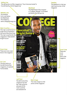
This is my final front cover. I chose design one of my mock up's, however, where I have placed the coverlines I have moved them slighlty as when I was making the main cover, I decided it looked better all on one side.
Preliminary Task: College Front Cover Mock Ups
Above are my college front cover design's, I made four different designs. I already knew my colour scheme so I only annoted the first design. My colour scheme was Grey and Yellow. The designs were similar, however, the way I made my Masthead and where I placed it are all different. Also where I placed my barcode are different, Design 1 and 2 are in the left third and Design 3 and 4 are in the top right hand corner.
Preliminary Task: Front Cover Texual Analysis
Denotation
The magazine consist a photograph of a man looking directly into the camera, he is also holding some textbooks. The photograph takes up the whole of the magazine. The background colour of the photograph is black with a faded white light behind the man. In front of the photograph of the man there are a variety of different cover-lines and behind the photograph there is the masthead of College. On the bottom left hand corner there is a bar card visible and the price of the magazine.
Mise En Scene
· Props
o A prop in the image would be the books he is holding; he is holding a Law, Business and Society book and another book behind to show he is studying and that he does attend college. Another prop would be the watch, showing that he needs to keep track of time. The chain is also prop is used to show that college still has a fun side to it, the chain is a cross, showing that anyone can attend college even if they are religious
· Lighting
o The lighting is both high and low key. Due to the background is seems more low key, however, the photograph of the man is quite bright. The lighting gradually get’s darker as it goes down the magazine. However, the lighting on the books the man is holding is quite bright and stands out
· Costume
o The clothes he is wearing is quite modern and smart, however it is not extremely smart, it is slightly casual his costume. He is also wearing jeans, which lowers the smartness of the costume down. The costume used shows that college is for a place for studying and fun
· Non-Verbal Communication
o His non-verbal communication is happy and he is smiling. His eyes look like he is ready to learn as they look quite serious, but not scary. The way he is standing is quite casual, as if he is just about to get into lesson
· Setting
o There is no setting in the image, as it is just a black and white background, however, the setting seems to be in a college, the props show this
Anchorage
The font used in the front cover is Sans Serif, which is modern. This font is used as it represents college as a modern thing. It also makes the magazine more appealing as it doesn’t look old and boring.
Magazine Conventions
· Masthead (Logo)
o The masthead is very outstanding and bright. The font used for the Masthead it Sans Serif. The word ‘college’ is in a large bright green font, and underneath to right written ‘lifestyle’ in white. The font for the word ‘college’ and ‘lifestyle’ are two different fonts, however they are both Sans Serif, which connote the modern of college
· Dateline
o The dateline is in the top right hand corner, in extremely small letters “summer 2009.” It is the only thing which is written in yellow, which makes it stand out even though the font is small. It is also in capital letters which enhances it more
· Main images
o The main image is the man in the middle, as it is an example of a college student. Also the “splat” on the right, it is important as it is in a bright pink and stands out largely as the rest of the colours in the magazine are green, white and black
· Cover-Lines
o There are eight different cover-lines. The main cover line is “Dancehalls Bright Future” making reference to the man’s future by attending college. Another main headline is to the right of the magazine “The ultimate spring break escape” it is a main article as it is in a larger font than the over headlines apart from the main, and it is written in capital letter.
· Left Third
o The left third of the magazine has the price of the magazine and the barcode.
· Barcode
o The barcode is faced horizontally to the left of the magazine
· Selling Line
o The selling line is “Your exclusive guide to everything Hip, Hop & Happening. It uses repetition of the H, which makes the magazine seem more interesting, also it will interest teenagers, the target audience of the magazine, as it uses the word “Hip” and “Hop”
Subscribe to:
Comments (Atom)


